Reimagining the Brand: From Insight to Identity
A brand redesign is about clarity, intention, and alignment. This project was an end-to-end reimagining of a brand identity, spanning research, naming, iconography, sitemap review, and landing page design. The goal was to create a cohesive, flexible system that reflects the brand’s purpose while positioning it for long-term growth.
Starting With Research
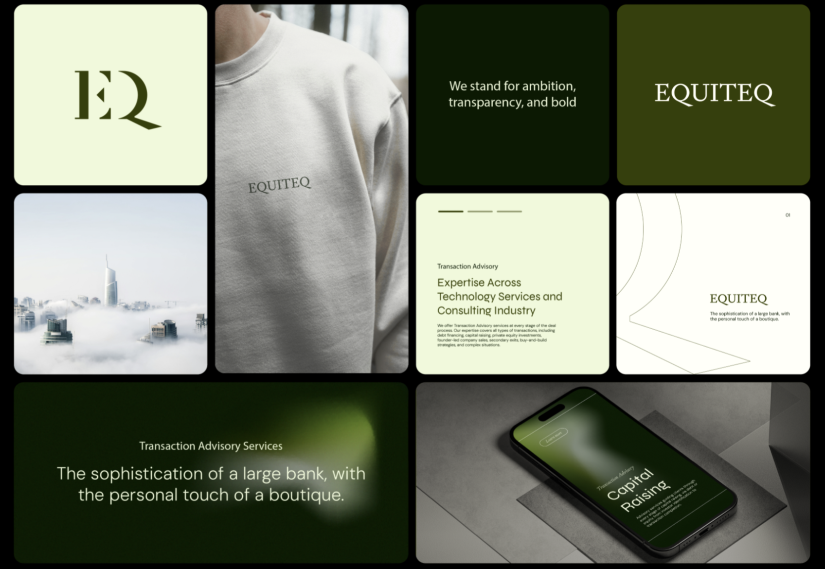
Equiteq is an elite global investment bank seeking a comprehensive global rebrand. As the firm continued to grow, its legacy brand no longer reflected its global scale, prestige, innovation, or depth of expertise.
Every strong brand begins with understanding. We kicked off the redesign with a combination of qualitative and quantitative research to uncover:
Core business goals and growth ambitions
Internal and external perceptions of the brand
Existing brand strengths and pain points
These insights formed the foundation of the work, ensuring the identity was not only visually compelling, but strategically grounded.
To deepen our understanding, we conducted 1:1 interviews with senior leadership to capture strategic priorities and long-term vision. We also facilitated focus group sessions to explore mind mapping and brand personification, uncovering how the brand is perceived and where it could evolve. A company-wide survey provided quantitative data around core values and future vision, while broader workshops helped identify key personas and explore how the brand could scale visually and adapt across regions. Together, these activities surfaced shared themes, misalignments, and opportunities for clarity, directly shaping the direction of the redesign.
Brand Personas
To ensure the brand resonated with Equiteq’s most important audiences, we developed a set of core brand personas to guide the design direction:
Founder / Entrepreneur (Seller)
Strategic Buyer (Buyer)
Private Equity Investor (Buyer)
Leadership (Talent)
Young Professional (Talent)
Due Diligence Providers (Partner)
These personas served as strategic reference points for shaping tone, visual language, messaging, and experience across all brand touchpoints. By deeply understanding each audience’s motivations, expectations, and emotional drivers, we ensured the brand resonated authentically and built meaningful trust at every interaction.
To learn more about the research behind creating the brand identify, view the Equiteq | Brand Redesign page.
Design Execution
With a clear strategic foundation in place, we translated insights into a cohesive visual brand identity designed to scale. Every design decision was rooted in the research, ensuring consistency, clarity, and longevity across brand and digital touchpoints.
Naming Exploration
We explored a range of naming concepts aligned with the brand’s positioning, values, and future vision. Each option was evaluated for clarity, memorability, and differentiation within the market. The selected name strikes a balance between approachability and confidence, providing a strong foundation for the refreshed identity.
Visual Identity & Iconography
The visual system was designed to be both distinctive and flexible. A refined color palette established recognition while allowing room for expansion across digital experiences. Custom iconography was created as part of a unified system, ensuring clarity, consistency, and scalability across interfaces.
Logotype & Brand Symbol
The logotype was crafted to feel modern, intentional, and timeless, with careful attention paid to proportion, legibility, and balance across sizes and formats. The accompanying brand symbol distills the essence of the brand into a recognizable mark that can stand alone or work in tandem with the logotype.
Sitemap Review & Landing Page Design
Beyond the visual identity, we reviewed and refined the sitemap to improve clarity and hierarchy across the digital experience. This work informed the landing page design, ensuring the brand’s story, value proposition, and key actions were communicated clearly and intuitively.