A Note on Access & Selected Work
Reach out & I’ll send over the password!
To respect client confidentiality and protect sensitive business information, portions of my portfolio are password-protected.
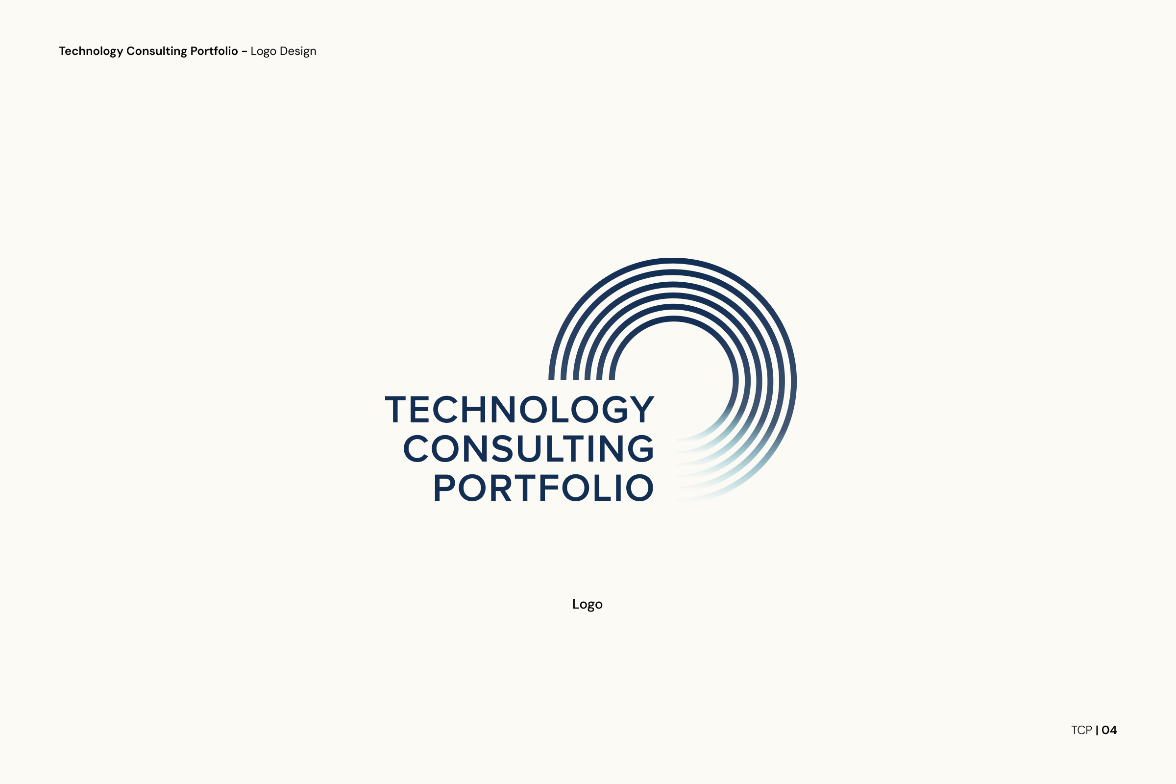
Logo Design: Technology Consulting Portfolio
During North Highland’s acquisition of The Bridge, there was a deliberate transition period focused on maintaining a distinct identity while integrating into the larger organization. This two-year phase required clarity, cohesion, and a strong sense of independence as teams, capabilities, and cultures merged.
As part of this transition, the design studio hosted an internal logo competition to establish a new identity for the combined technology practice: Technology Consulting Portfolio.
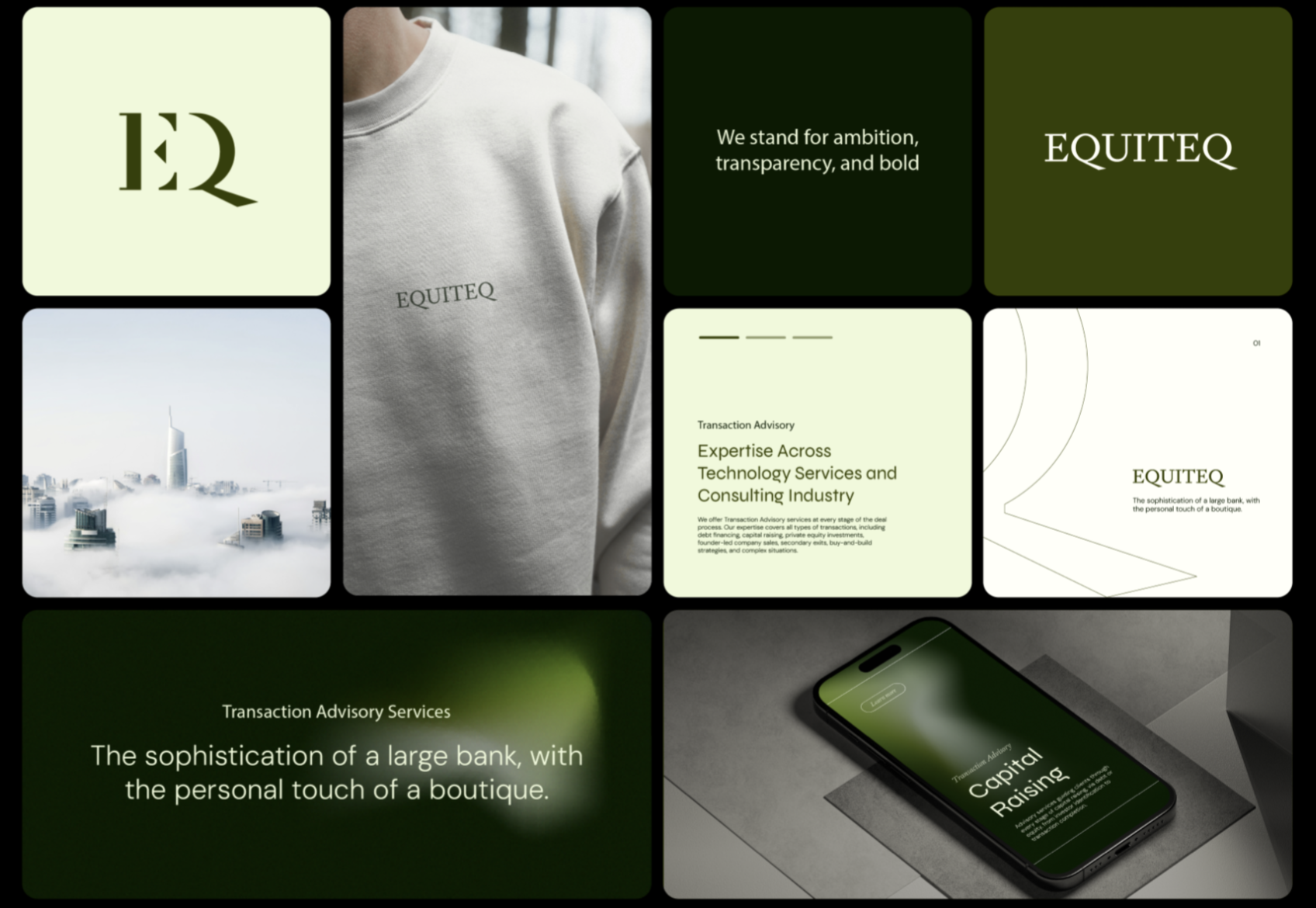
Reimagining the Brand: From Insight to Identity
This project was an end-to-end reimagining of a brand identity, spanning research, naming, iconography, sitemap review, and landing page design. Equiteq is an elite global investment bank that was seeking a comprehensive global rebrand. As the firm continued to grow, its legacy brand no longer reflected its global scale, prestige, innovation, or depth of expertise.
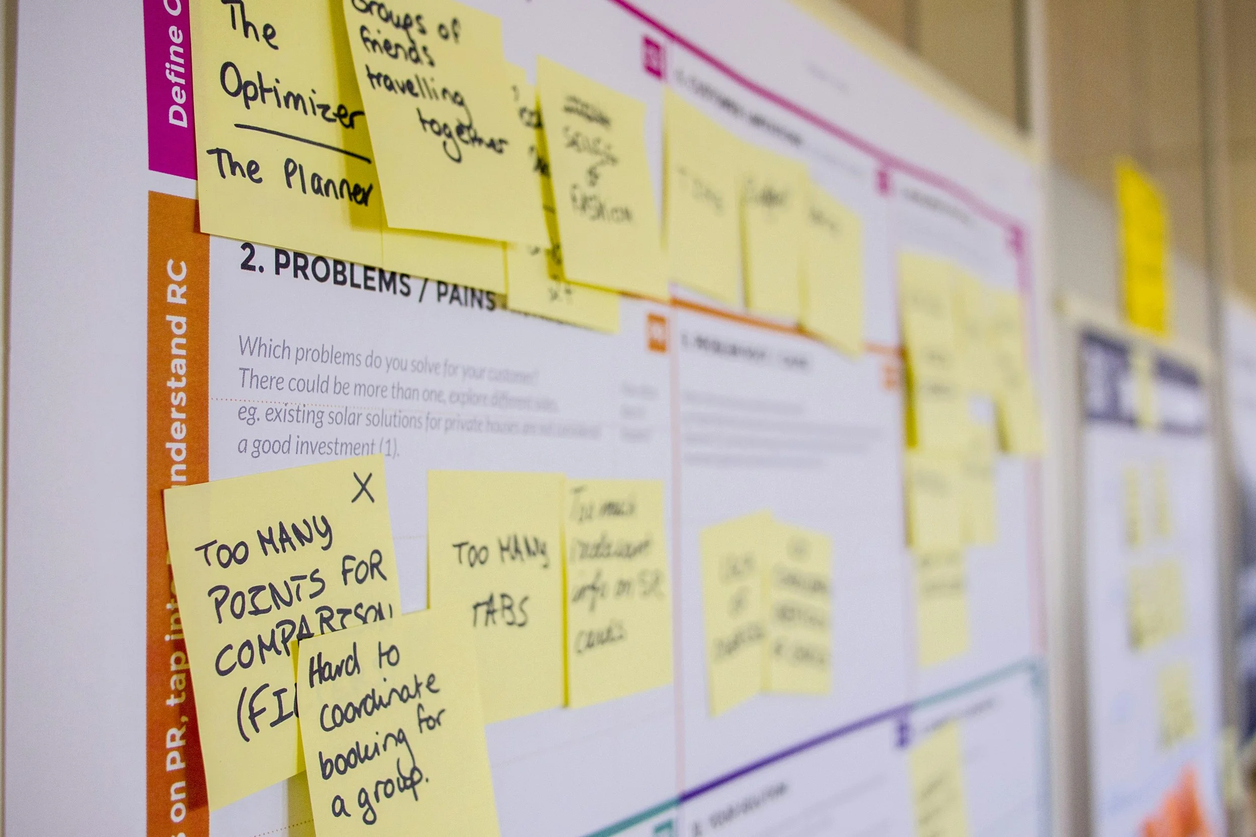
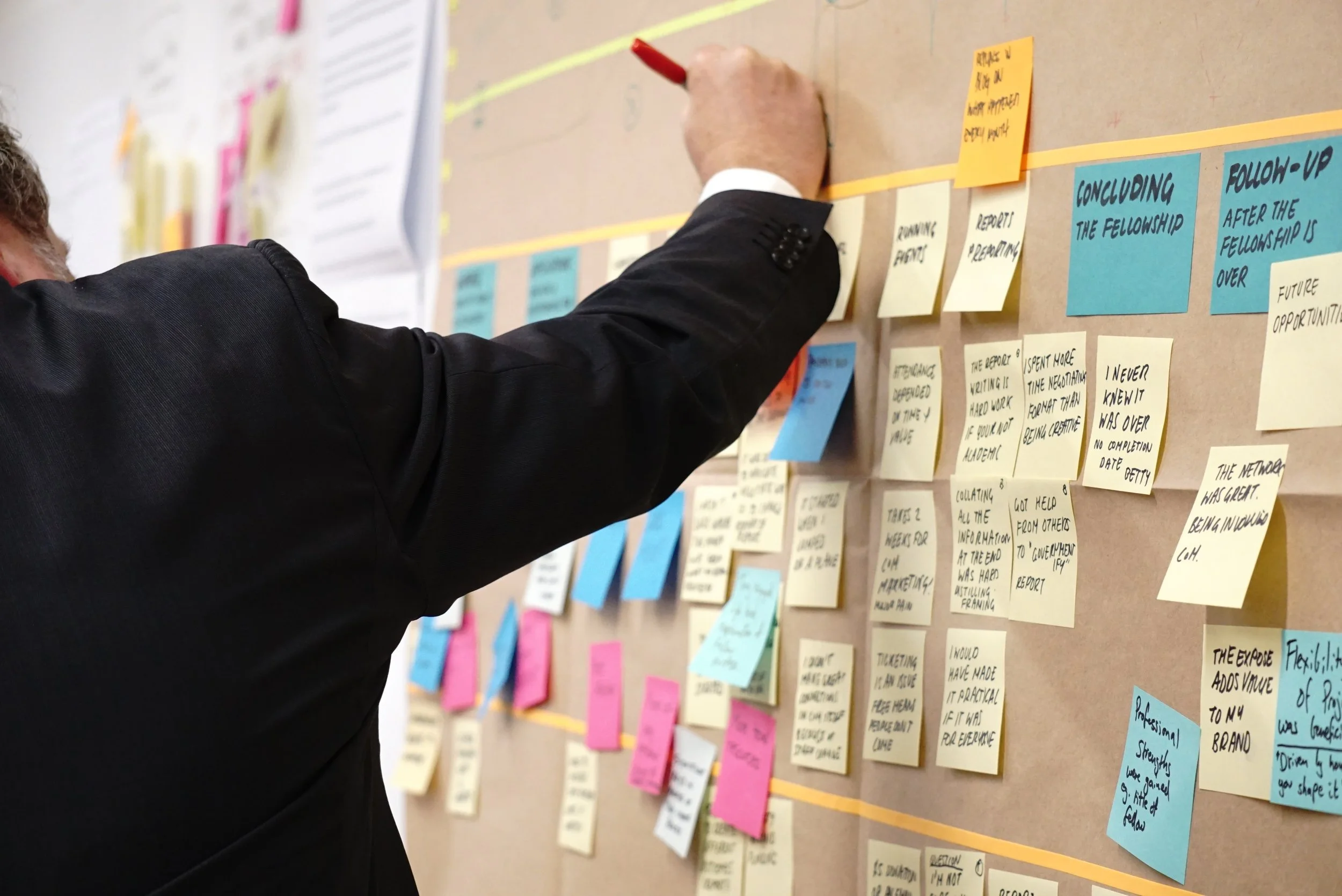
UX Research vs. Design Research: What’s the Difference?
UX Research and Design Research are often used interchangeably, but they serve different, and complementary purposes. Understanding how they differ helps teams ask better questions, apply insights more effectively, and ultimately create more meaningful products.
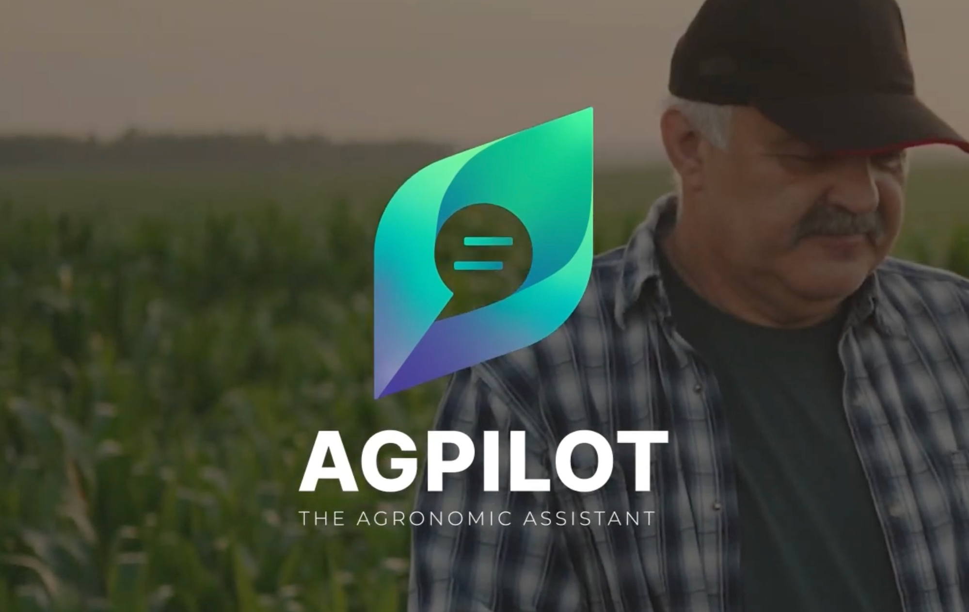
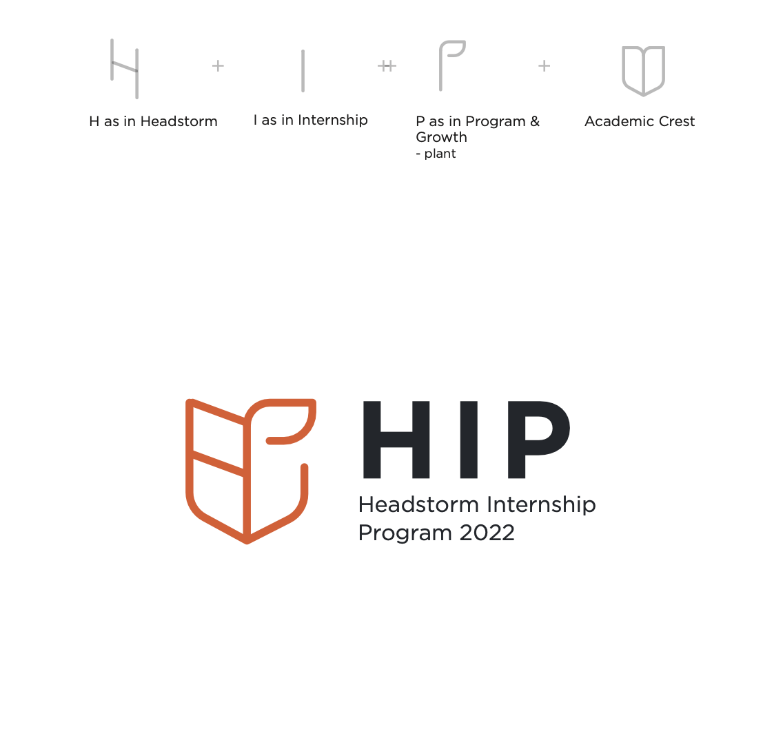
Video Editing & Motion Graphic Design for Headstorm's AGPilot
Hello everyone! I’m excited to share a video project I recently completed for Headstorm, aimed at supporting our sales team. Utilizing Adobe Premiere and Adobe After Effects, I crafted a dynamic and engaging video for Headstorm’s AGPILOT product.
AGPILOT is an innovative tool designed by Headstorm that leverages advanced AI and data analytics to provide real-time insights and recommendations for agronomists. It helps them make informed decisions, improve crop yields, and reduce waste.
Unlocking Product Management Success
I’m excited to share a few lessons I’ve learned in my role as a Product Manager for a data analytics platform initiative. One takeaway has consistently stood out: the importance of staying organized.
In product management, where multiple workstreams, stakeholders, and timelines are constantly in motion, organization isn’t just helpful; it’s essential. The ability to create structure amid complexity directly impacts clarity, momentum, and outcomes.

Video Editing & Motion Graphic Design For Headstorm
To support onboarding and introduce new hires to the company’s leadership and history, I edited an interview-style video featuring CEO Lawrence King. Using Adobe Premiere Pro for the primary edit and After Effects for motion graphics and visual enhancements, I helped shape a polished, engaging piece that brought clarity and narrative flow to the CEO’s story.

My Journey in Product Management Consulting at Headstorm
I'm Meredith Lyon, a Senior Consultant at Headstorm. I want to share my experience in the world of software development and technology consulting with you. My job is all about working on diverse projects, learning constantly, and making a positive impact.
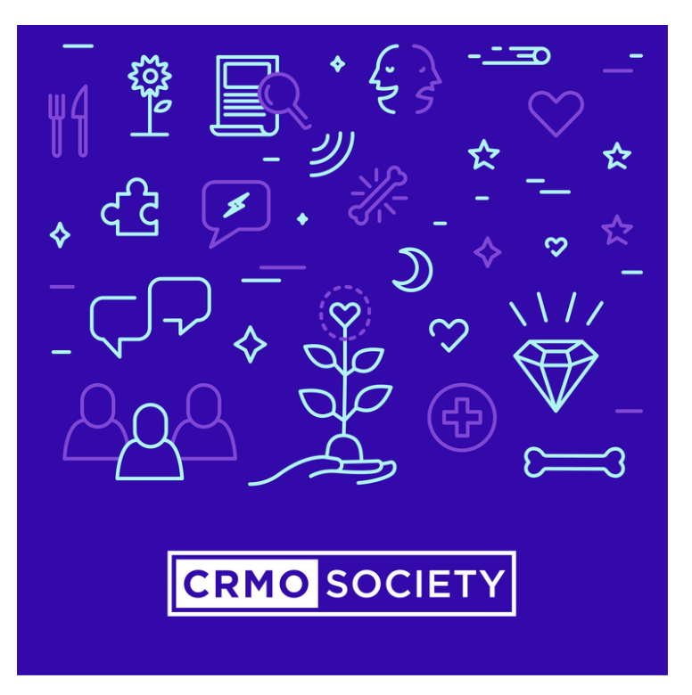
Showcasing CRMO Society Animation & Graphics
I am excited to share a glimpse of my recent work for CRMO Society. The animation and graphics showcase my commitment to creating engaging user experiences that align with our clients' visions.
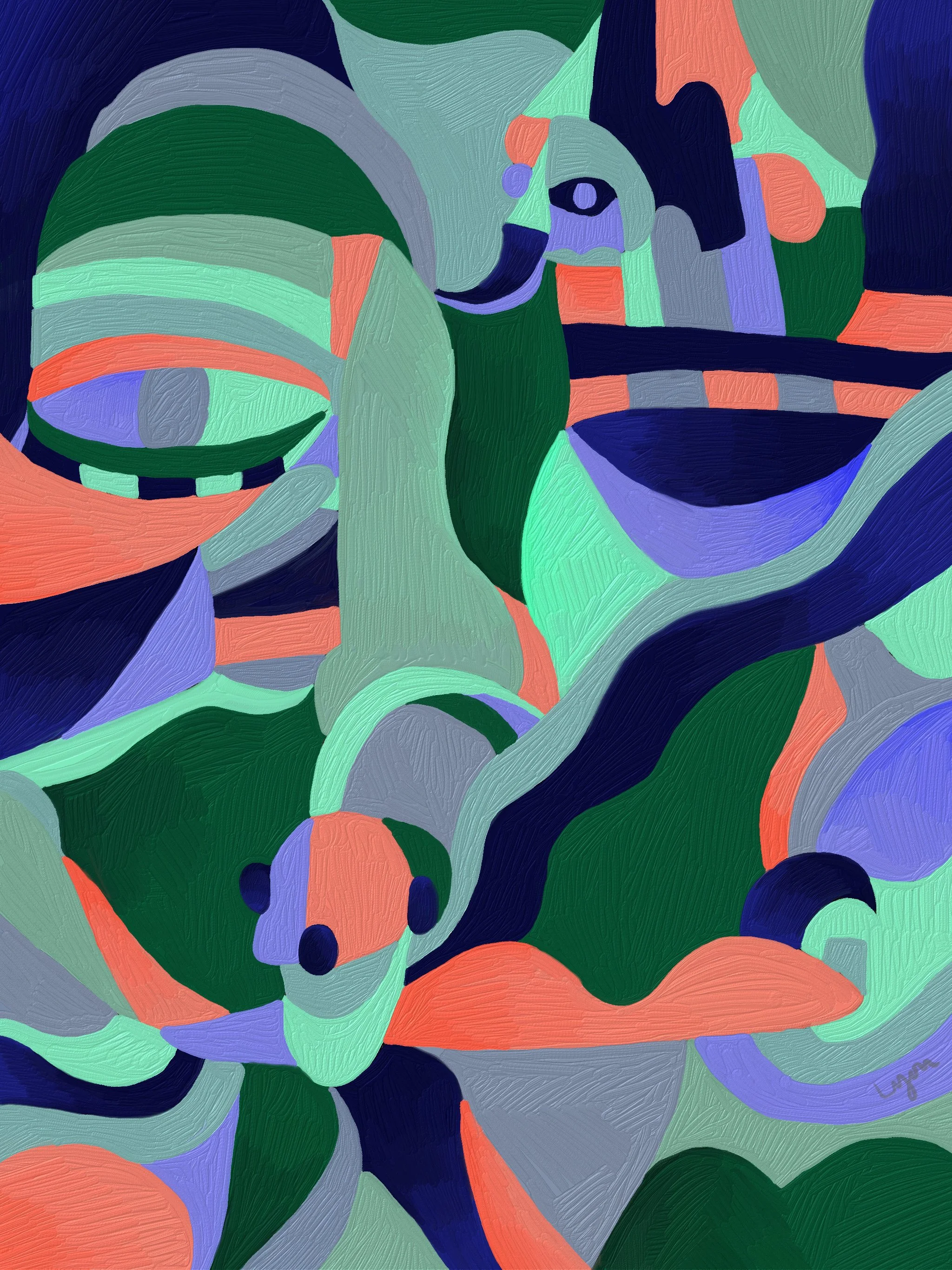
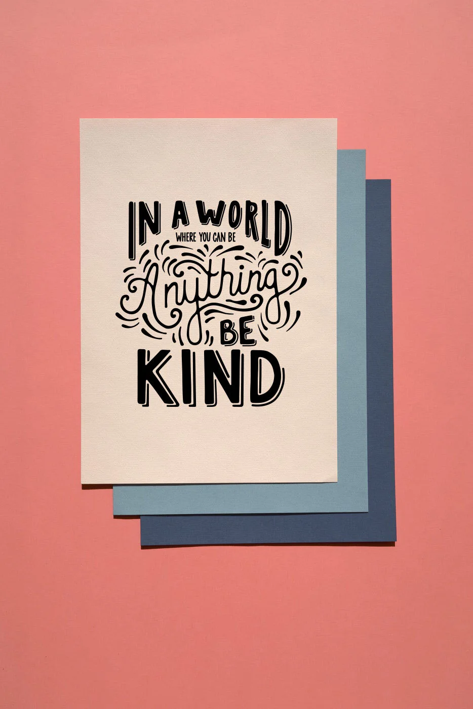
Creating for the joy of it
Outside of my professional work, I spend time creating simply for the joy of it. One of my favorite creative outlets is making artwork in Adobe Fresco, often beginning with pencil and paper before transitioning the piece into a digital format.
Starting on paper allows ideas to stay loose and intuitive. There’s no pressure to perfect a line or commit to a final direction. Once the foundation feels right, I move the work into Fresco, where I refine shapes, layer color, and experiment with texture and composition.
This blend of analog and digital mirrors how I approach design more broadly: exploring freely, then applying structure and polish. Creating art this way gives me space to experiment, recharge, and stay connected to the tactile side of creativity, even when the final result lives on a screen.
This piece is one example of that process, capturing the transition from hand-drawn beginnings to a fully realized digital painting.