Reimagining Equiteq:
A Global Rebrand Initiative
A brand redesign is never just about aesthetics. It’s about clarity, intention, and alignment. This project was an end-to-end reimagining of a brand identity, spanning research, naming, logo design, color evaluation, iconography, sitemap review, and landing page design. The goal was to create a cohesive, flexible system that reflects the brand’s purpose while positioning it for long-term growth.
Project Overview
A brand redesign is never just about aesthetics. It’s about clarity, intention, and alignment. This project was an end-to-end reimagining of a brand identity, spanning research, naming, logo design, color evaluation, iconography, sitemap review, and landing page design. The goal was to create a cohesive, flexible system that reflects the brand’s purpose while positioning it for long-term growth.
MY ROLE
On this project, I acted as both Project Manager and Research Lead. I owned planning and weekly status communications, led the rebrand research end-to-end, and collaborated with designers to translate insights into the visual identity and broader brand system.

STARTING WITH RESEARCH
Equiteq is an elite global investment bank seeking a comprehensive global rebrand. As the firm continued to grow, its legacy brand no longer reflected its global scale, prestige, innovation, or depth of expertise.
Every strong brand begins with understanding. We kicked off the redesign with a combination of qualitative and quantitative research to uncover:
Core business goals and growth ambitions
Internal and external perceptions of the brand
Existing brand strengths and pain points
To deepen our understanding, we conducted 1:1 interviews with senior leadership to capture strategic priorities and long-term vision. We also facilitated focus group sessions to explore mind mapping and brand personification, uncovering how the brand is perceived and where it could evolve. A company-wide survey provided quantitative data around core values and future vision, while broader workshops helped identify key personas and explore how the brand could scale visually and adapt across regions. Together, these activities surfaced shared themes, misalignments, and opportunities for clarity, directly shaping the direction of the redesign.
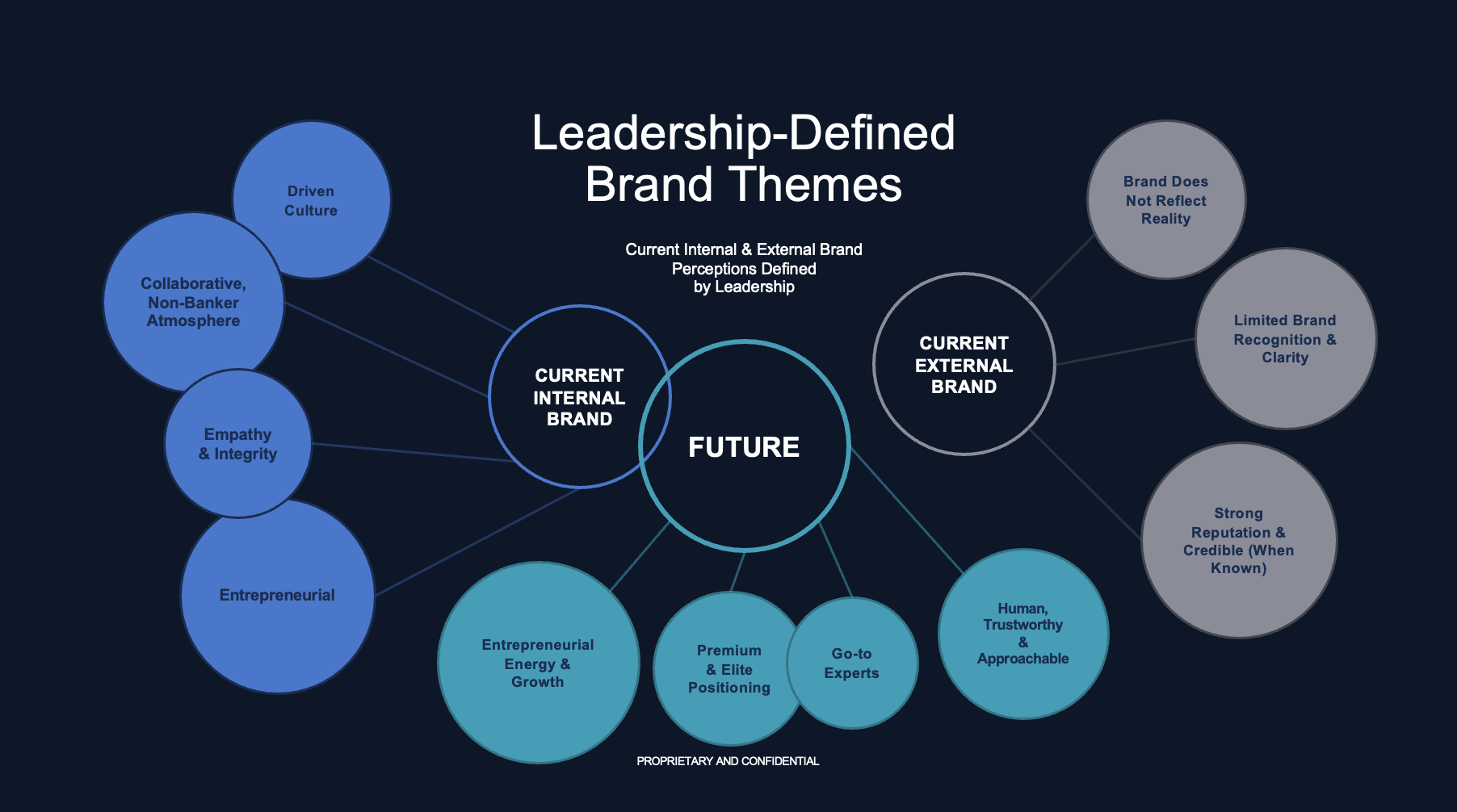
Key Themes & Insights
Across interviews, surveys, and workshops, several consistent themes emerged. These insights shaped both the internal cultural narrative and the future-facing brand direction.
Internal Culture
Internally, Equiteq is consistently described as a high-achievement environment where excellence is a shared expectation. Achievement was frequently cited as a core value that “really drives everything,” reinforcing a culture where individuals are motivated to perform at a high level.
The culture was often characterized as “work hard, play hard,” with teams striving for excellence while maintaining strong camaraderie. Notably, despite operating within investment banking, Equiteq’s culture is viewed as unusually caring. Employees emphasized that the firm does not reflect the stereotypical “sharp-elbowed” banking environment. Instead, the people were described as nicer, more cerebral, and thoughtful, creating a workplace grounded in respect and empathy.
Future Brand Direction
These same qualities strongly informed the future brand vision. The brand should evoke trust and partnership, reflecting pride in a culture rooted in empathy. Equiteq is seen as a firm of elite experts who are also “people-people”, highly knowledgeable, yet deeply relational. This balance between expertise and humanity became a defining pillar for how the brand should evolve.
Competitive Analysis
To understand the broader landscape and identify opportunities for differentiation, we conducted a competitive analysis across leading investment banks, focusing on brand expression through logo design and digital presence.
LAZARD
Logo
Lazard’s logo features an all-caps serif wordmark with a subtly oversized and heavier “L,” creating visual hierarchy and emphasis. The serif typography conveys a strong sense of history and legacy, reinforcing the brand’s established, authoritative positioning.
Website
The website leans into a bold, editorial aesthetic, characterized by large-scale typography and confident visual statements. This approach reinforces Lazard’s stature and thought leadership within the category.
HOULIHAN LOKEY
Logo
Houlihan Lokey takes a more contemporary approach, using a sans-serif typeface paired with a global mark. This signals international scale and a modern brand posture, differentiating it from more traditionally styled competitors.
Website
The digital experience is clean and modern, consistent with a high-end corporate aesthetic. The design leverages the established logo and core color palette, extended with complementary tones to create a cohesive and polished system.
EVERCORE
Logo
Evercore’s logo also uses a refined serif wordmark, conveying professionalism, credibility, and heritage. While similar in tone to Lazard, the execution is more restrained and understated, emphasizing sophistication over prominence.
Website
The website adopts a minimalist design approach that feels clean, modern, and highly functional. The restrained visual language places emphasis on clarity, usability, and content, aligning with a more contemporary expression of trust.
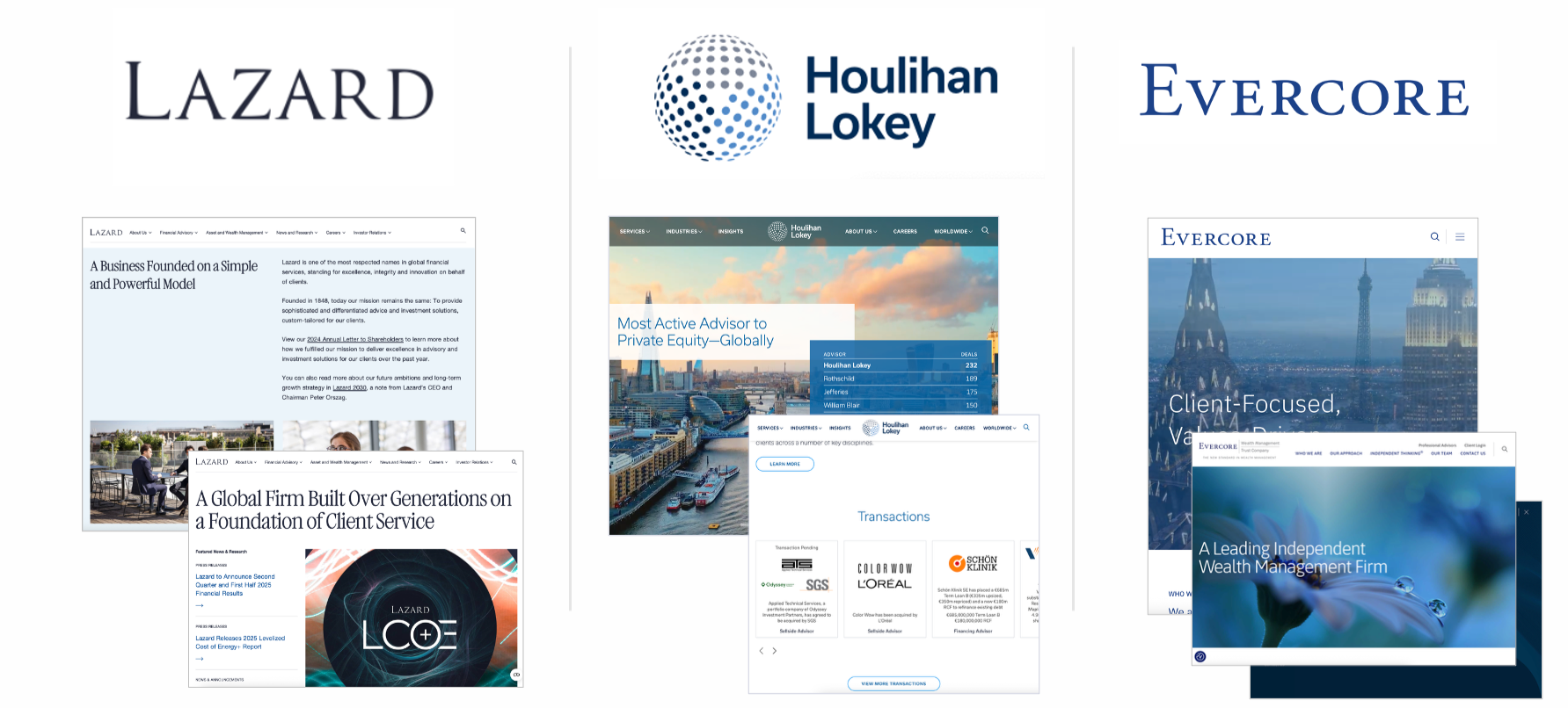
Key Takeaways
Across the competitive landscape, serif typography and heritage cues remain common, particularly among legacy firms. However, differentiation emerges through tone, restraint, and modernity, from editorial boldness to minimalist clarity and contemporary global signaling. These insights informed opportunities for Equiteq to balance prestige with approachability, and expertise with a more human, modern expression.

BRAND EQUITY ASSESSMENT
To evaluate Equiteq’s existing brand strength and assess the strategic risk of a potential name change, we conducted a comprehensive brand equity assessment. This helped us understand how much equity the brand currently held and where change could create value versus risk.
The assessment was structured across three key dimensions:
Brand Awareness
Performance & Quality
Brand Associations
Each dimension included a defined set of indicators used to evaluate the brand’s current position. Scores and relative weightings were applied to reflect the overall impact of each dimension. Brand awareness and performance carried slightly higher weight, as they encompassed more indicators and play a greater role in influencing brand strength and market perception.
Taken together, this framework provided a clear, structured view of Equiteq’s overall brand equity and served as a critical input into decisions around naming, positioning, and the scope of the rebrand.
DESIGN
EXECUTION
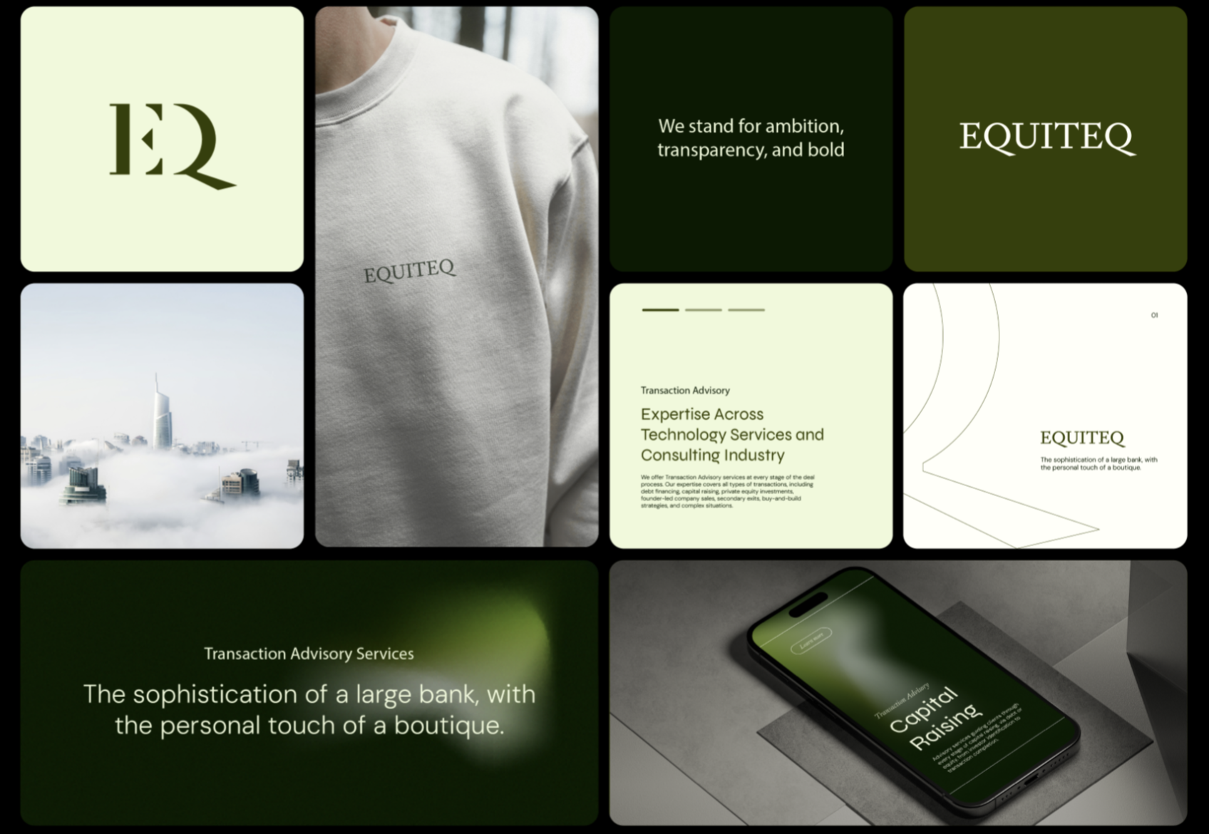
Our team translated insights into a cohesive visual brand identity designed to scale. Every design decision was rooted in the research, ensuring consistency, clarity, and longevity across brand and digital touchpoints.
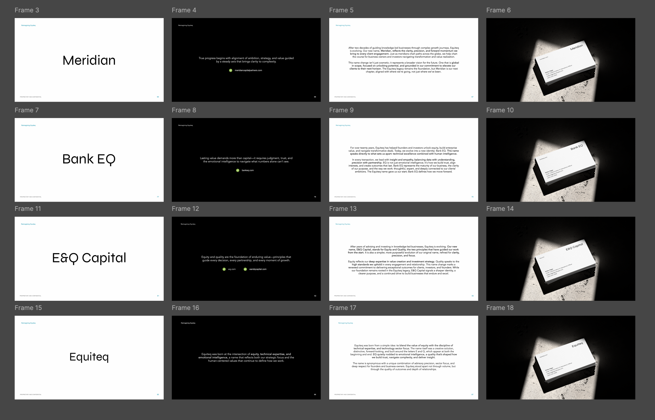
Naming Exploration
We explored a range of naming concepts aligned with the brand’s positioning, values, and future vision. Each option was evaluated for clarity, memorability, and differentiation within the market. The selected name strikes a balance between approachability and confidence, providing a strong foundation for the refreshed identity. Here are a few of the company names that we explored.
Meridian
Bank EQ
E & Q Capitol
Equiteq
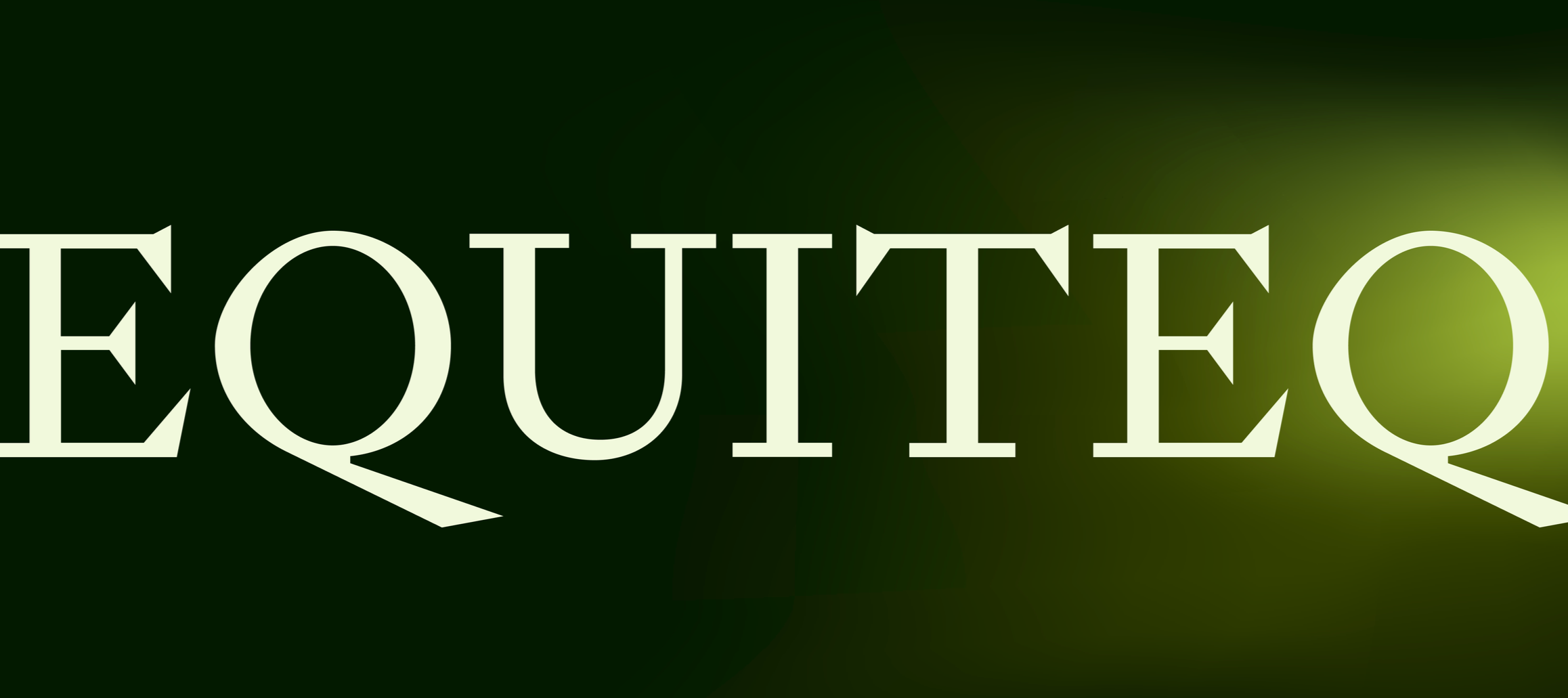
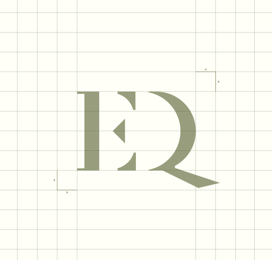
ICONOGRAPHY
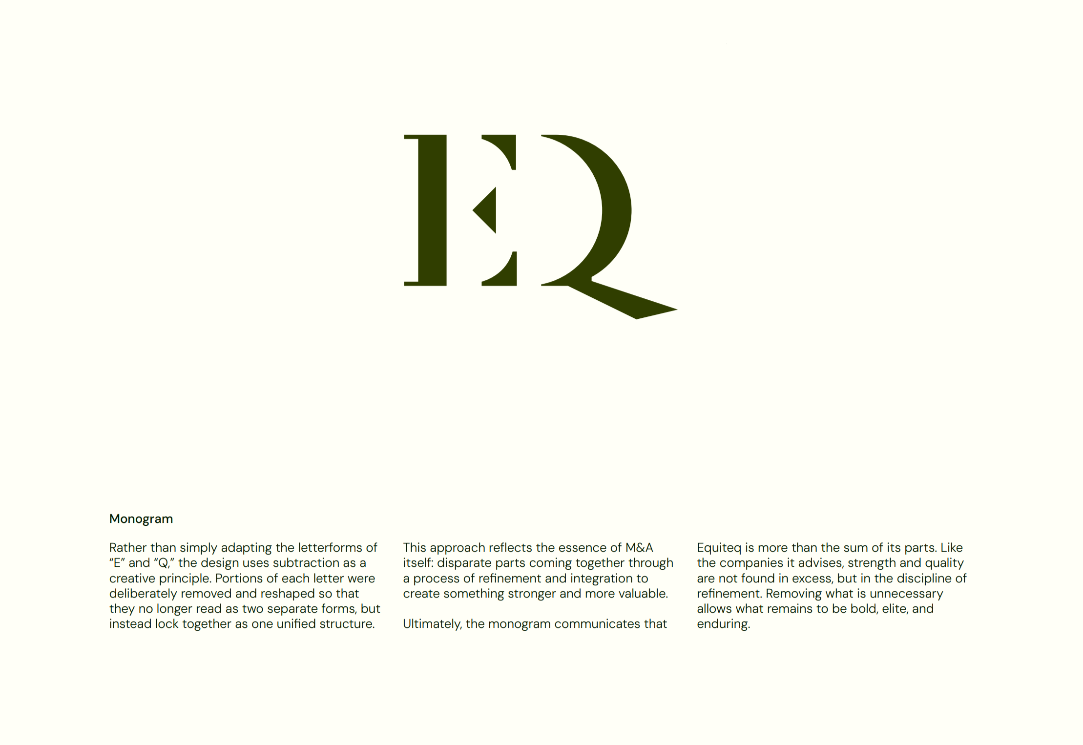
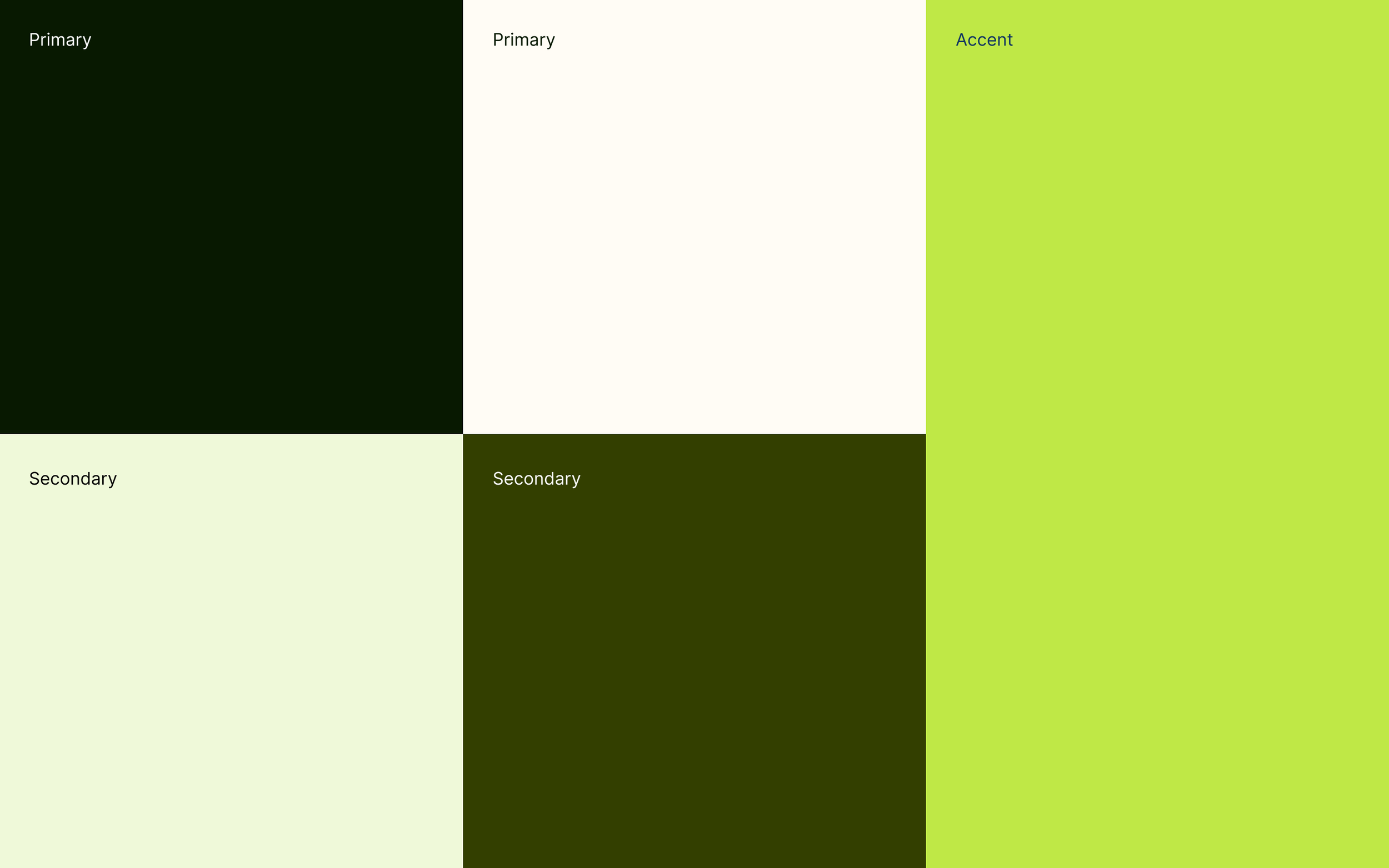
The visual system was designed to be both distinctive and flexible. A refined color palette established recognition while allowing room for expansion across digital experiences. Custom iconography was created as part of a unified system, ensuring clarity, consistency, and scalability across interfaces
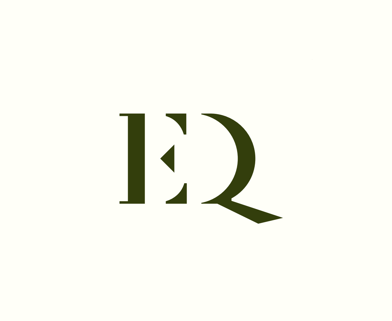
The logotype was crafted to feel modern, intentional, and timeless, with careful attention paid to proportion, legibility, and balance across sizes and formats. The accompanying brand symbol distills the essence of the brand into a recognizable mark that can stand alone or work in tandem with the logotype.
Logotype & Brand Symbol
Sitemap Review & Landing Page Design
Beyond the visual identity, we reviewed and refined the sitemap to improve clarity and hierarchy across the digital experience. This work informed the landing page design, ensuring the brand’s story, value proposition, and key actions were communicated clearly and intuitively.